The Comfortable Color Palettes That Will Help You Relax and De-Stress


Back in the early 2000s, Eva Heller, a German psychologist, published a book that is still discussed in universities from all around the world.
That book is called “The Psychology of Color” and it’s based on a research study of 2000 people; men and women ages 14 to 97 from all walks of life. In it, Heller demonstrates how colors affect human emotion and reason.
The most interesting thing about this read is getting to see how the way we perceive colors –and what they mean to us– is pretty universal. Colors can be (and are) used to wordlessly convey a wide variety of feelings and ideas such as joy (yellow), tranquility (blue), or boredom (brown).
This article is going to focus on comfortable colors; color combinations that convey comfort and relaxation. Let’s get right into it:
🌊 The color blue
Blue is the favorite color of, approximately, 45% of the population.
Blue is the color of great qualities, like sympathy, harmony, fidelity, and intellectuality, but can also turn cold and distant. Because of that, because of its calming effect, blue features heavily on bedroom walls from all around the globe.
1. Harmony
“Harmony” is mainly associated with blue (27%), green (23%), white (9%), red (8%), gold (6%), and (27%) other.

The color blue is mostly associated with good feelings. Not the passionate kind (wherein red rules), but the kind that are born out of peace and understanding.
2. Trust and fidelity
“Trust” is mainly associated with (35%) blue, (24%) green, (11%) gold, (11%) yellow, and (19%) other.

“Fidelity” is mainly associated with (35%) blue, (18%) green, (10%) gold, (8%) red, and (29%) other.

When someone is unwavering in their commitment, and extremely loyal, we call them a “true-blue”: blue is heavily associated with fidelity and trust.
See also the old wedding tradition: “Something old, something new, something borrowed and something… blue.”
3. Eternity
“Eternity” is mainly associated with (29%) blue, (26%) white, (25%) black, and (20%) other.

Blue is the color of the ocean and the sky. Unsurprisingly, we associate it with vastness, infinity, and eternity.
5. Passivity
“Passivity” is mainly associated with (24%) blue, (18%) white, (14%) silver, (13%) green, (10%) gray, and (21%) other.

🍀 The color green
“Green” is the favorite color of, approximately, 15% of the population. Curiously, as we grow older, we tend to appreciate it more. Especially men.
We associate the color green with nature, freshness, and life.
1. Nice
We perceive “niceness” as green (22%), blue (20%), orange (14%), yellow (12%), pink (8%), and other (23%).

2. Natural
“Natural” is mainly associated with green (47%), white (18%), brown (12%), blue (9%), and other (14%).

From our society’s point of view, green is the color that symbolizes nature. That’s the reason behind phrases like “green spaces” or “green lung”, and expressions like “having a green thumb”.
3. Tranquility and shelter
“Tranquility” is mainly associated with green (38%), blue (24%), white (8%), brown (6%), and other (24%).

“Shelter” is mainly associated with green (24%), brown (20%), blue (19%), red (9%), and other (28%).

To this day, the room where actors rest is still called the “green room”. This is because they were (and some still are) actually painted green. Green walls helped entertainers rest their eyes after being in the spotlight.
Green is a calming color and it conveys feelings of safety. Just think: what’s the brand color of Aspirin? That’s right, a blue-ish green.
🏳️ The color white
White is the color of innocence, good, perfection, and spirituality.
1. Goodness
“Goodness” is mainly associated with white (42%), blue (18%), gold (15%), and other (25%).

2. Perfection
“Perfection” is mainly associated with white (26%), gold (19%), blue (17%), and other (38%).

3. Honesty
“Honesty” is mainly associated with white (33%), blue (22%), gold (16%), and other (29%).

As you can see, white, blue, and gold are the colors of truth, honesty, and goodness. White is a color of absolutes. The purer the white, the more perfect it is.
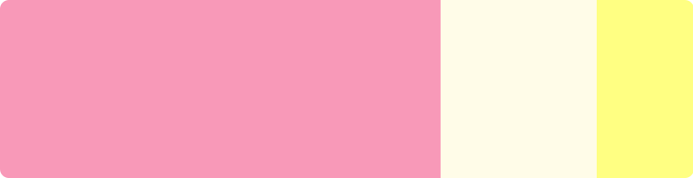
🌸 The color pink
Pink, the color of tenderness, also conveys “softness” when combined (45%) with white (16%), and yellow (10%).
🍂 The color brown
Interestingly, the amount of people who hate orange and brown is higher than the amount of people who have it as their favorite color.
However, combined with brown, gold, and yellow, the color brown conveys the feeling of “Autumn”. Which, as everyone knows, is the coziest season of all. The fall easily conjures an image of fuzzy socks and hot chocolate in front of a fireplace. Hard to beat comfort-wise.
“Autumn” is mainly associated with (48%) brown, (22%) gold, (12%) orange, (10%) yellow, and( 8%) other.

🐺 The color gray
Despite being widely regarded as a dull and sad color, gray also features heavily in “reflection”, which is mainly associated with a combination gray (26%), blue (21%), white (15%), black (11%), brown (9%), and other (18%).

The colors to avoid
Here are the colors to AVOID when going for a stress-free and relaxing environment:
🍎 The color red
Red es the first color (besides black and white) that humanity named. It’s the color of blood and fire; passion and emotion.
1. Hate
“Hate” is mainly associated with (38%) red, (35%) black, (15%) yellow, and (12%) other.

2. Energy
“Energy” is mainly associated with (38%) red, (20%) yellow, (12%) orange, (11%) blue, and (19%) other.

3. Aggressiveness
“Aggressiveness” is mainly associated with (37%) red, (21%) black, (8%) orange, and (34%) other.

4. Excitement
“Excitement” is mainly associated with (37%) red, (18%) orange, (11%) violet, (8%) yellow, and (26%) other.

Red is the color of war. Mars, the red planet, was also the Roman god of war, violence, and passion.
If you’re looking to create a peaceful and stress-free environment, please don’t paint your walls red.
♟️ The color black
Black is the color of power, death, and violence.
1. Violence, Brutality
“Violence” is mainly associated with (47%) black, (20%) red, (14%) brown, and (19%) other.

2. Heaviness
“Heaviness” is mainly associated with (54%) black, (18%) brown, (8%) gold, (8%) gray, and (12%) other.

Tightness and hardness are also feelings where black features heavily, so it’s a color to avoid if you don’t want to feel overwhelmed.
🍊 The color orange
1. Intrusive, harassing
“Harassment” is mainly associated with (18%) orange, (16%) yellow, (16%) violet, (13%) red, (12%) pink, and (25%) other.
2. Activity
“Activity” is mainly associated with (25%) red, (18%) orange, (18%) yellow, (15%) green, and (24%) other.

Red, yellow, and orange always come to mind when we think about intense feelings. Orange is also very present within the combinations that make us think about passion and excitement (19%). Thus, if you are trying to create a cozy environment, it’s better to avoid the fierceness of red and orange, and, instead, lean towards a cozier palette. Like orange, gold, and brown.
The conclusion
Here’s the bottom line:
- If you’re looking for comfort, blue, green, and white are your colors. Combine them to create a peaceful and stress-free environment.
- If calm is what you’re seeking, avoid palettes where red, yellow, and orange feature heavily. They are energizing colors.